Carla Eckhard, Arvid van de Reep, Roberto Terracciano
Role
UI Design
Tools
Figma, Vimeo
Duration
1 Week
Deliverable
App re-design, Design System
Images
Copyright by Mosaert
Methods
Quantative Research, Qualitative Research, Affinity Map, User Persona, Task Flows, Wireframing, Concept Testing, High-Fidelity, User Testing and more.
Introduction
Are you a Dutch kid from the 80’s or 90’s? Then there’s a pretty good chance you had an intense-colored Hyves-profile. Just before it’s crash and bankruptcy in the mid 2000’s, it had more than 9 million active useraccounts. It was all before Facebook took over.
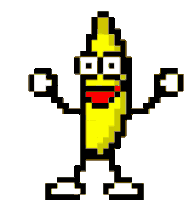
For an assignment during my Ironhack UX/UI Design study, I practiced my UI-skills by redesigning the popular Hyves-profile platform. It was known for customizable profile pages, creating and attending own groups and, of course, the dancing banana. For everyone who is’nt Dutch, or under 25, let me introduce him, so you get a bit of the feeling.
From 2010 the website kept losing more and more visitors, partly by the popularity of the american Facebook.
WIKIPEDIA ABOUT HYVES
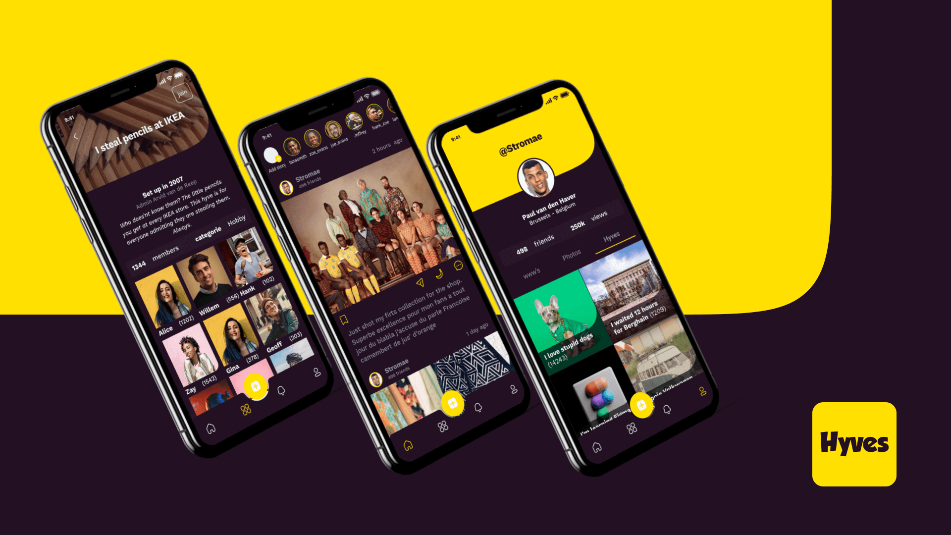
THE REDESIGN
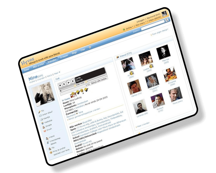
Screenshot of the old Hyves profile-page
Brand attributes
Every brand has it’s own personality. Every brand has it’s own look and feel. As did Hyves in the early 2000’s, shown on the screenshot of the original Hyves-page. The characterises of a brand are the so-called brand attributes.For this assignment I looked at the brand attributes to use for a redesign and came up with the following two:
Playful light-hearted or full of fun; a desire for fun; synonym of Gaiety: defined as a state or feeling of being happy or cheerful, or it refers to entertainments, amusements or light-hearted fun
Clean spotless, neat, well kept; removed from dirt, marks, or stains.
Colors
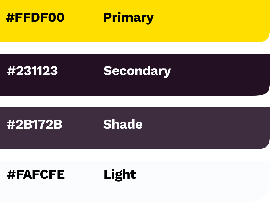
Color theory is a good start when learning as a designer. To get know rules and standard for contrast for example. For the redesign I used different color-palettes, based on the te orginal brand colors of Hyves.
After playing around I decided to go for a banana-yellow as primary color. It works good as a playful and clean characteristic color. The secondary color is a dark purple, since this is the complementary color to yellow on the color-wheel.
The chosen color palette with high contrasting colors
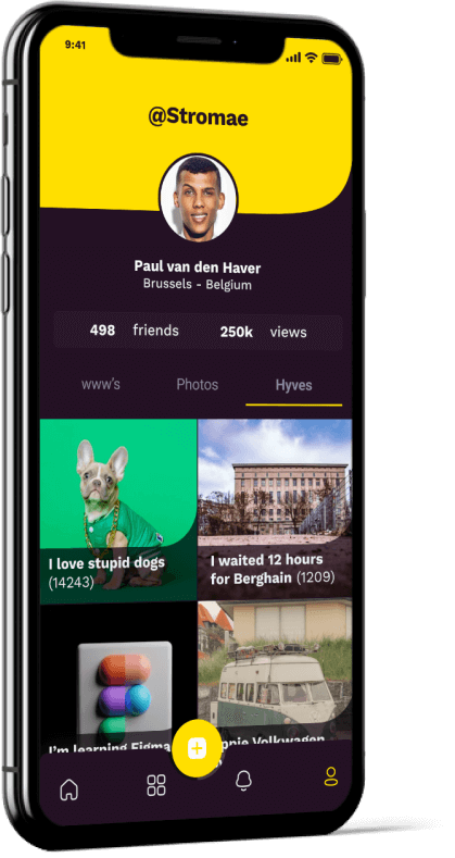
Iterating the design
Playing around with different colors, shapes and gridstyles is a good way to find the right look and feel for a brand. For both the profile-page, chatbox and newsfeed I’ve tried and tested multiple iterations.
Banana curves
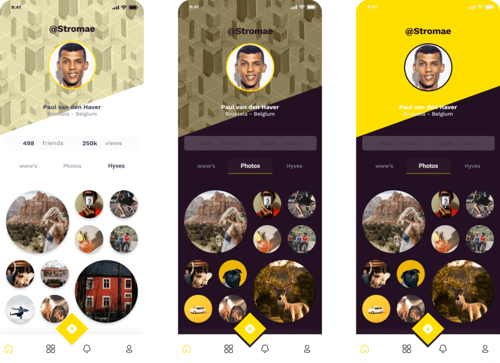
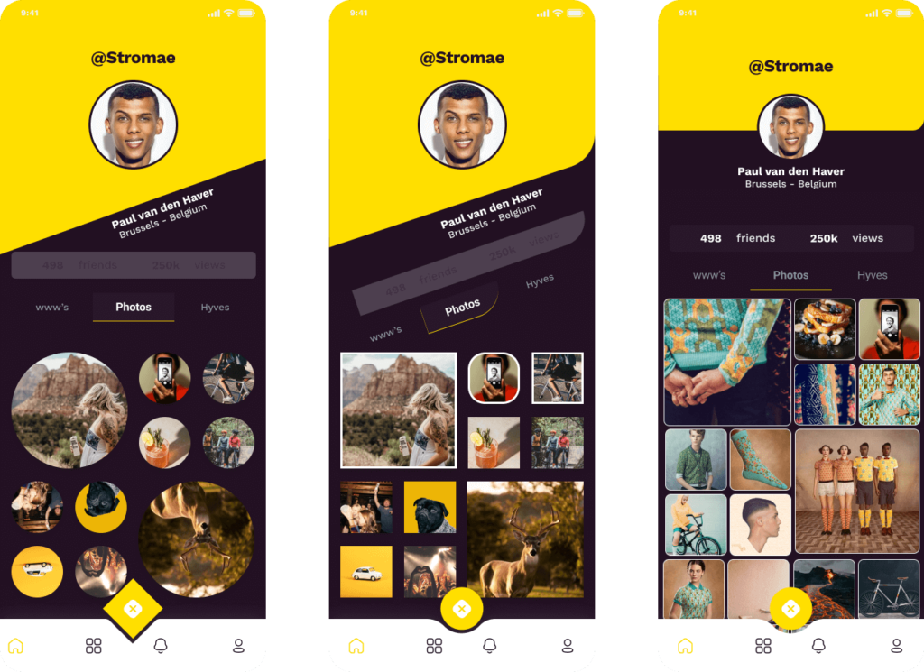
When creating the different components for the design, I came up with a one-sided curve. This curve became my so-called banana-curve: An aesthetic design choice to match not only the playful brand attribute, but also to honor the dancing little fella, seen earlier in this case. You get it right? 😉
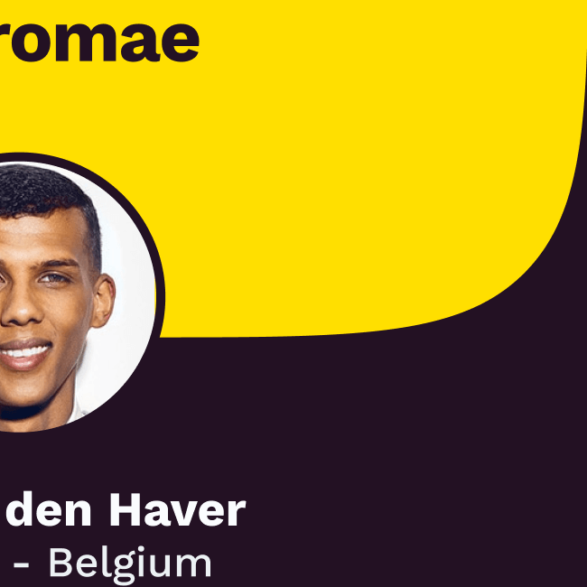
Iterations of the profile screen
The banana curve in action
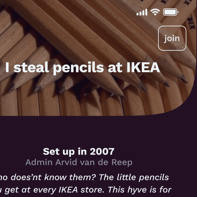
Creating your own group
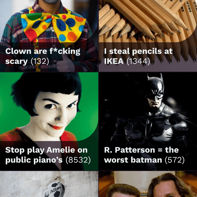
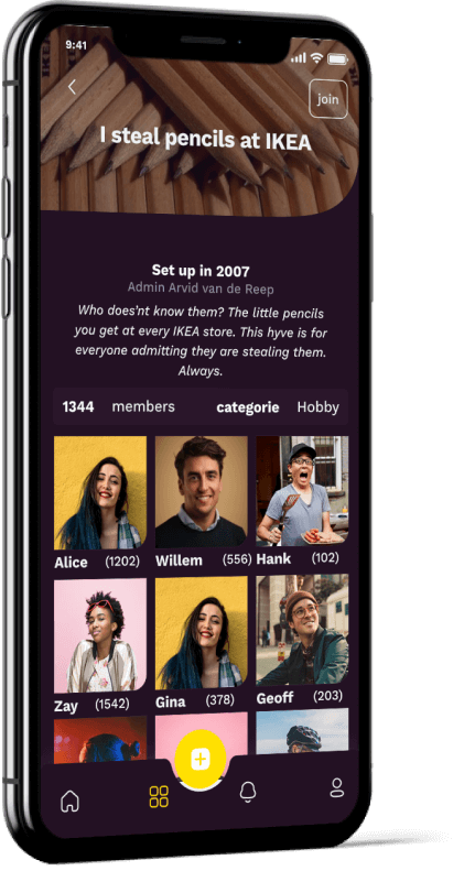
One thing Hyves was know for, was the ability to create your own groups. It could be about anything. And that is exactly what happened: the social platfrom ended up with a dozen useless, stupid, fun or boring groups you could join.
Therefore, when doing the redesign, this was a functionality I wanted to keep in the final design. A screenshot from the final design of my personal favorite group is shown: ‘I steal pencils at IKEA’.
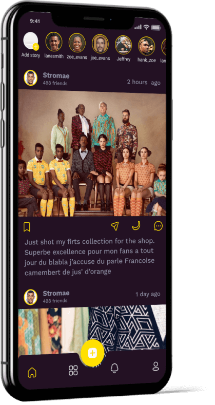
Newsfeed and chat
The newsfeed is nothing new compared to the nowadays version of Instagram. in fact, I learned that designing is’nt about reinventing the wheel! To keep consistency I’ve replaced the well-know heart-icon with a banana-icon. So you can show your gratitude in a more playful way.
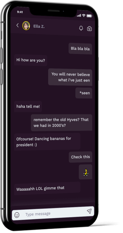
The chatscreen is designed with a clean chatfunction compared to Whatsapp. I’ve added the same moving iconset as it existed back in the 00’s.
Thanks for scrolling this far. If you have any questions regarding this project, feel free to reach out. Want to work together or hang out for any reason? Shoot me a message.
")