Carla Eckhard, Arvid van de Reep, Roberto Terracciano
Role
UX Research, UX Design, UI Design
Tools
Figma, UxTweaks, Figjam, Google Forms,
Duration
5 weeks
Deliverable
App prototype, Design System
Methods
Quantative Research, Qualitative Research, Affinity Map, User Persona, Task Flows, Wireframing, Concept Testing, High-Fidelity, User Testing and more.
Introduction
This case study covers the final project of three cycling enthusiasts Carla Eckhard, Arvid Van de Reep and Roberto Terracciano within Ironhack’s UX/UI Design part-time bootcamp program 2022.
The project consists of a 5 stages Design Thinking process, UX research, ideation, design and testing of the prototype of the app for the Six Day Berlin event.
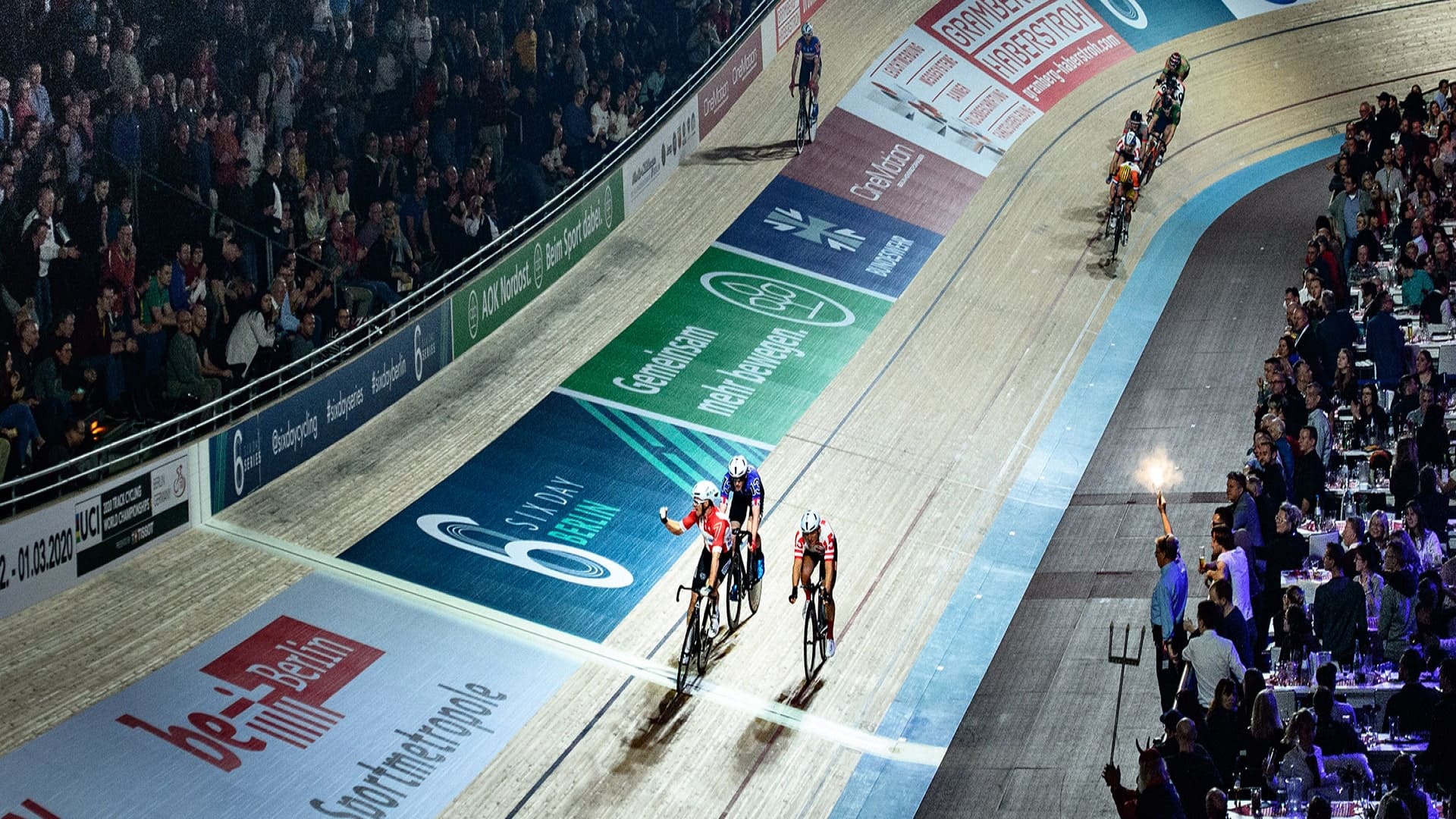
Six Day is the most known track cycling event and it dates back to mid 1800’s. The analogue driven event has changed a lot through time and it is now ready for a ride into the digital mobile world.
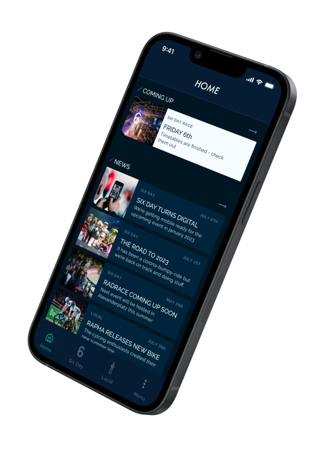
Mockup startscreen Six Day Berlin App
Summary
3 days packed with over 15 different race types and rules, thrilling sprints, in an international framework. Six Day Berlin provides a great spectacle and an occasion not to be missed if you’re a race cycling fan. Blending novelty and tradition, Six Day Berlin seeks to enhance the visitors’ experience with the application.
Six Days asked to create a tool that keeps engagement at the venue and in-between the different cycling events.
The app aims at preparing the event visit perfectly, and giving insights about the race rules while you’re there. Not only that: spectators will be able to explore and connect with the local and vivid cycling world in and around Berlin.
1. EMPATHIZE
Benchmarking research
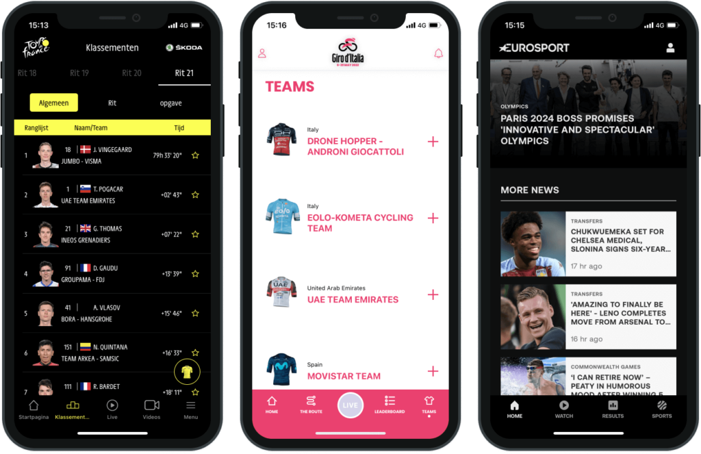
In the benchmarking phase, we focused on those events that, just like SixDays, last a few days a year. We looked into sports events – but also music festivals – to understand which feature could possibly interest a niche audience such as Six Day’s. Thereby serving our stakeholders’ needs as well to keep engagement at the venue and in between events.
We analyzed apps such as Roland Garros’s, Six Nation’s, Giro d’Italia and Tour de France to understand pains and gains and start outlining the must-haves of a sports app. That includes features such as the ticketing system and the timetables but also UI elements like top-app bars and menus.
‘a good experience with technology – either in or out the stadium – has a positive knock-on effect in terms of overall engagement’ with the event.
CAPGEMINI REPORT 2019
Desk Research
More secondary research was done by reading reports about sports and technology. Some useful insights and data backed our assumptions on how to enhance the user experience for the Six Day-visitors. The 2019 Capgemini-report about emerging technologies in sports, concludes that ‘a good experience with technology – either in or out the stadium – has a positive knock-on effect in terms of overall engagement’ with the event. 56% of the sportfans who enjoyed their tech-enabled experience said they would actually go to more physical matches. So we started looking into the habits of Six Day visitors, to get insights regarding their engagement with the event.
Online survey
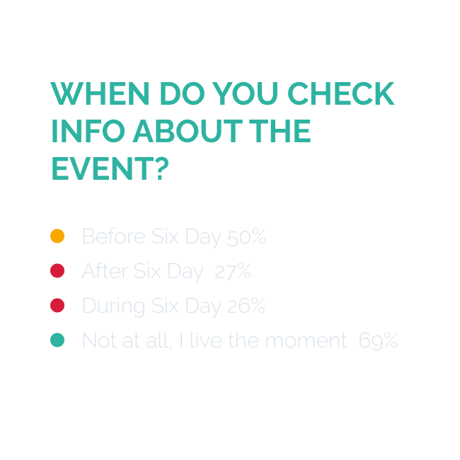
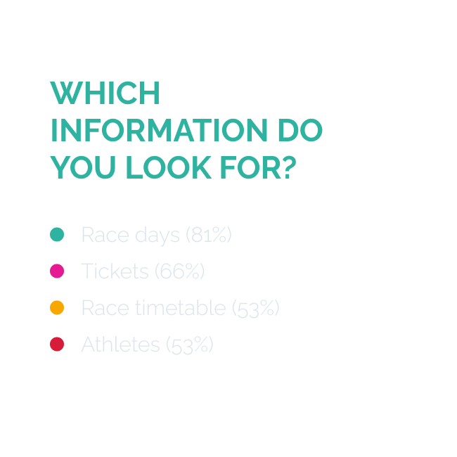
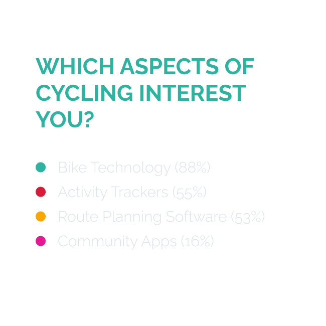
We’ve used the Lean Survey Canvas to create a short and powerful survey in Google Forms.. We’ve reached out to Six Day Berlin visitors using the stakeholder’s mailing list. 287 recipients answered the survey-questions. The questions aimed at discovering the attitude towards cycling in general, their interests within the topic of track cycling and behavior around the Six Day event. The survey data gave us information about the visitors attitude for cycling and their behaviour during the event. As can been seen in the images below.
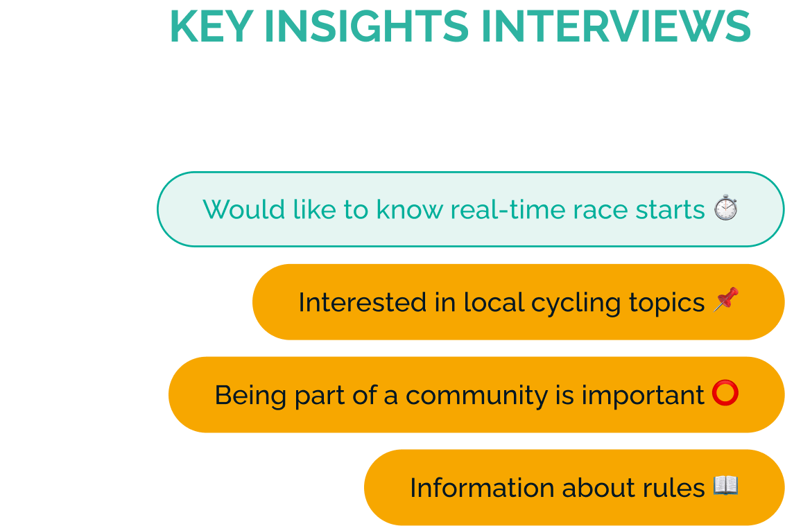
Interviews
We prepared an interview-script with questions that allowed us to follow a structured interviewing process, ensuring that each interview was recorded in a consistent manner. With this guide, we conducted +20 user interviews.
Users were mainly concerned about the real-time scheduling of the races and understanding the rules of the different cycling disciplines. Also information about the riders was mentioned more than once as being important. When gathering the interview data also a ‘pattern emerged referring to a sense of community’
2. DEFINE
User personas
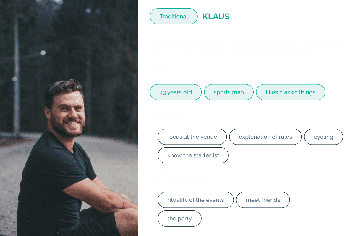
Klaus
From the patterns that emerged from qualitative and quantitative research we were able to track down two user personas.
Klaus is a man in his early forties, passionate about sports and really enjoys the Six Day tradition and rituals. Despite being a veteran attendee, Klaus doesn’t always remember all the rules of every track race discipline such as the Madison or the Keirin and he needs to refresh his memory about rules and athletes.
Klaus: “I am not new to Six Day but everytime I am taken away from the event. I want to have more info about what is happening on the track”.
PROBLEM STATEMENT KLAUS
‘Klaus needs a way to get information before the event on his sports interests so he doesn’t miss the action when he’s there.’
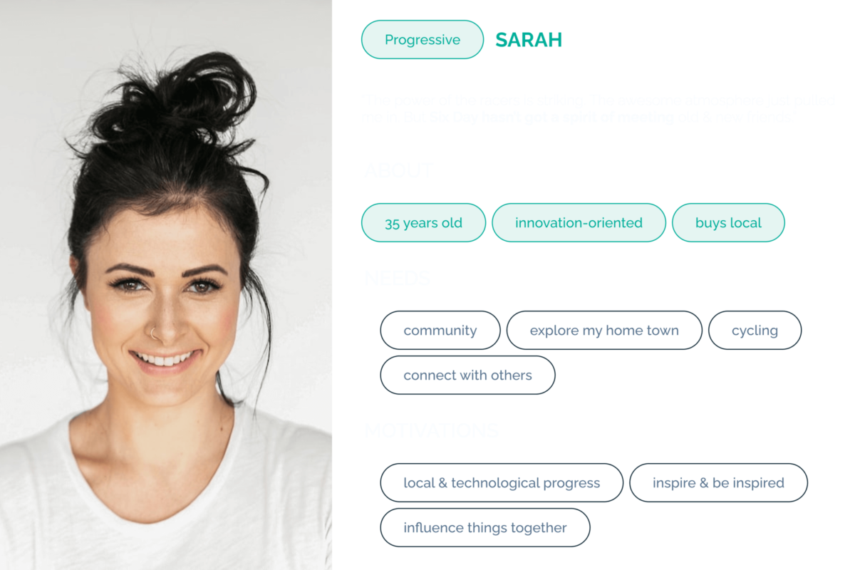
Sarah
Sarah is a woman in her thirties and she is very innovation-oriented. She’s very interested in bike technology, particularly when it comes to local brands and non-industrial processes. Six Day is a great chance for her to see the technologies, but she feels that the event is disconnected from the local bike communities.
Sarah: “The power of the racers is striking. The awesome atmosphere just pulled me in. But Six Day hasn’t got a spirit of meeting old & new friends.”
PROBLEM STATEMENT SARAH
Sarah needs a way to meet with interesting new local sports creators so she can stay connected to the local sports community that’s constantly evolving
3. IDEATE
Brainstorming: the features
For ideation we used different brainstorming methods, including the worst possible idea. Also trigger cards helped to come up with new ideas to match the needs of our user personas.
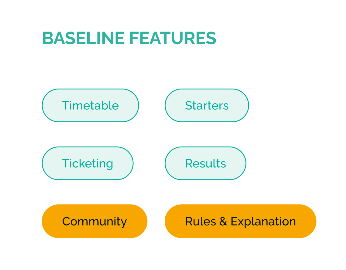
With the help of an Impact Matrix and the MoSCoW method we were able to prioritize the features based on impact and effort. We decided to add a baseline with standard features, containing a timetable, starters-list, ticketing-system and results-overview.
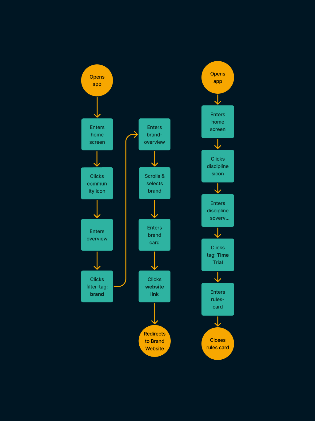
Task flows
With the initial research completed and after creating the general concept, we designed 7 task flows. The chosen task flows we’re used for designing and testing with a mid-fi prototype, inspired on the Material design-kit in Figma.
4. Prototype and Tests
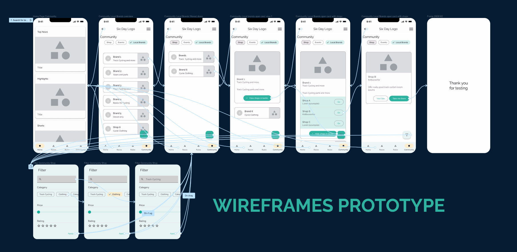
Wireframing low/med fidelity
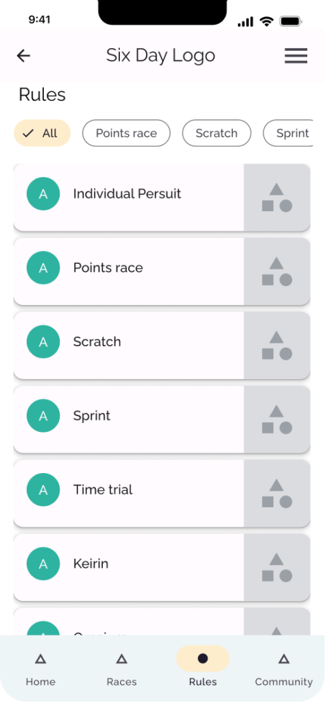
Material design inspired wireframes were sketched for testing purpose. We asked 20 visitors to test our prototypes. We asked them to accomplish different tasks. From choosing a race of interest at a preferred date, checking the rules of a certain race, to finding local initiatives or needed bike parts.
But testing grey boxes is as challenging as riding a bike without pedals, it makes you aware of the pitfalls and painpoints. Nonetheless we got valuable insights
In the first iteration, we designed a two level-menu based on tabs and search filters as the method for searching the rules. Although the feedback was very positive, our testers requested a search bar, that we later implemented. In short:
Users were looking for a searchbar, so we added this in later iterations.
The ‘community’ menu-item was misleading to users: we changed it to ‘local’ in later iterations.
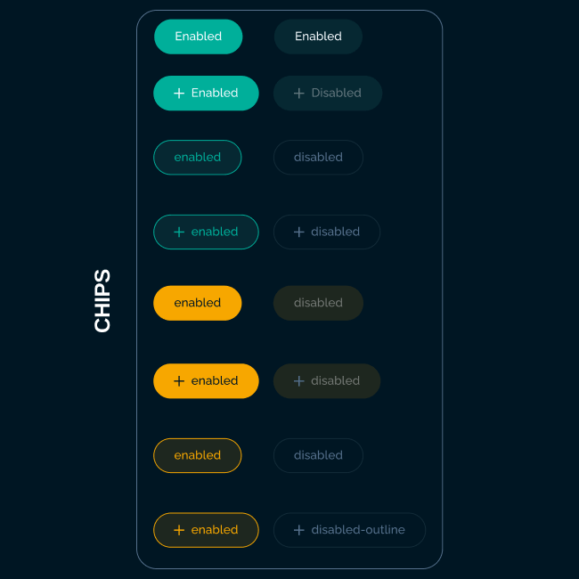
Filter chips on top worked out great for quick and easy filtering, we tested with different variations.
1
2
3
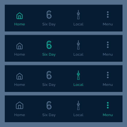
Community versus Local
When given the task to find a local brand, users seemed confused by the naming of the navigation bar item ‘Community’. They suspected a chat for cycling experts rather than a place where the local community could showcase.
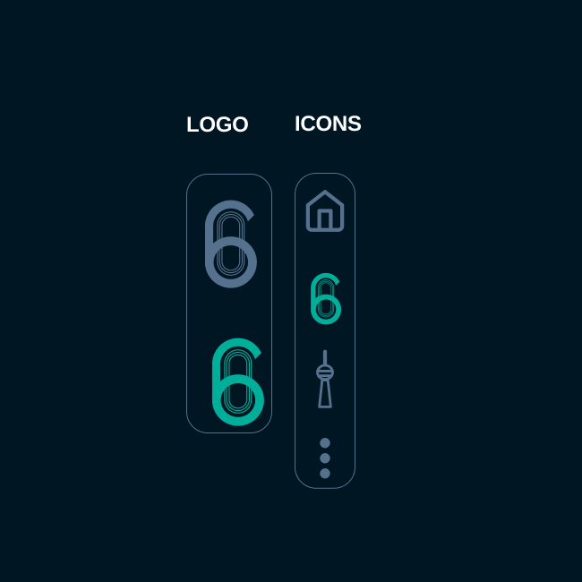
As a user said: “Community is misleading. I’d expected a chat or a forum here”, so we dropped the term and named it Local. Besides, we designed the icon of the Berlin TV tower, because it’s a strong and well-known landmark.
Design
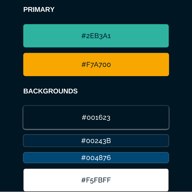
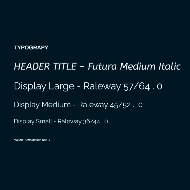
The starting point to work towards a final design was the existing website from Six Day and a brand guide provided by the stakeholder. The existing website contains of a small set of components used throughout the different screens. A white font is used on a dark blue, linear gradient background. A primary and secondary brand color used for titles and cta’s.
We decided to stick to the primary brand colors for consistency. The orange and green are used for buttons, chips and titles. From the dark blue gradient background, we’ve created different monochrome tones, to create a visual hierarchy between the different components used in our final design.
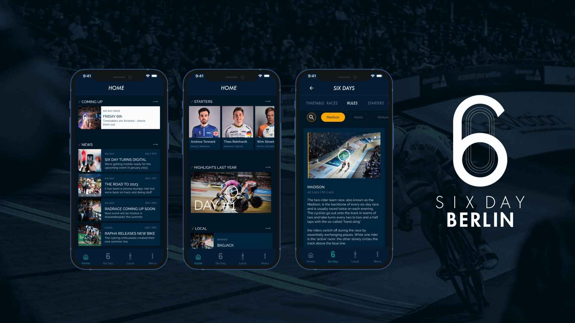
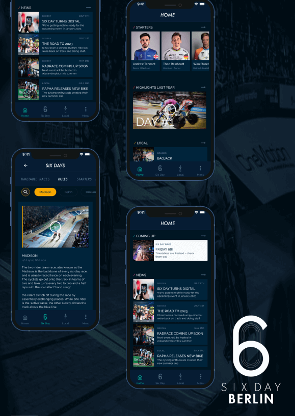
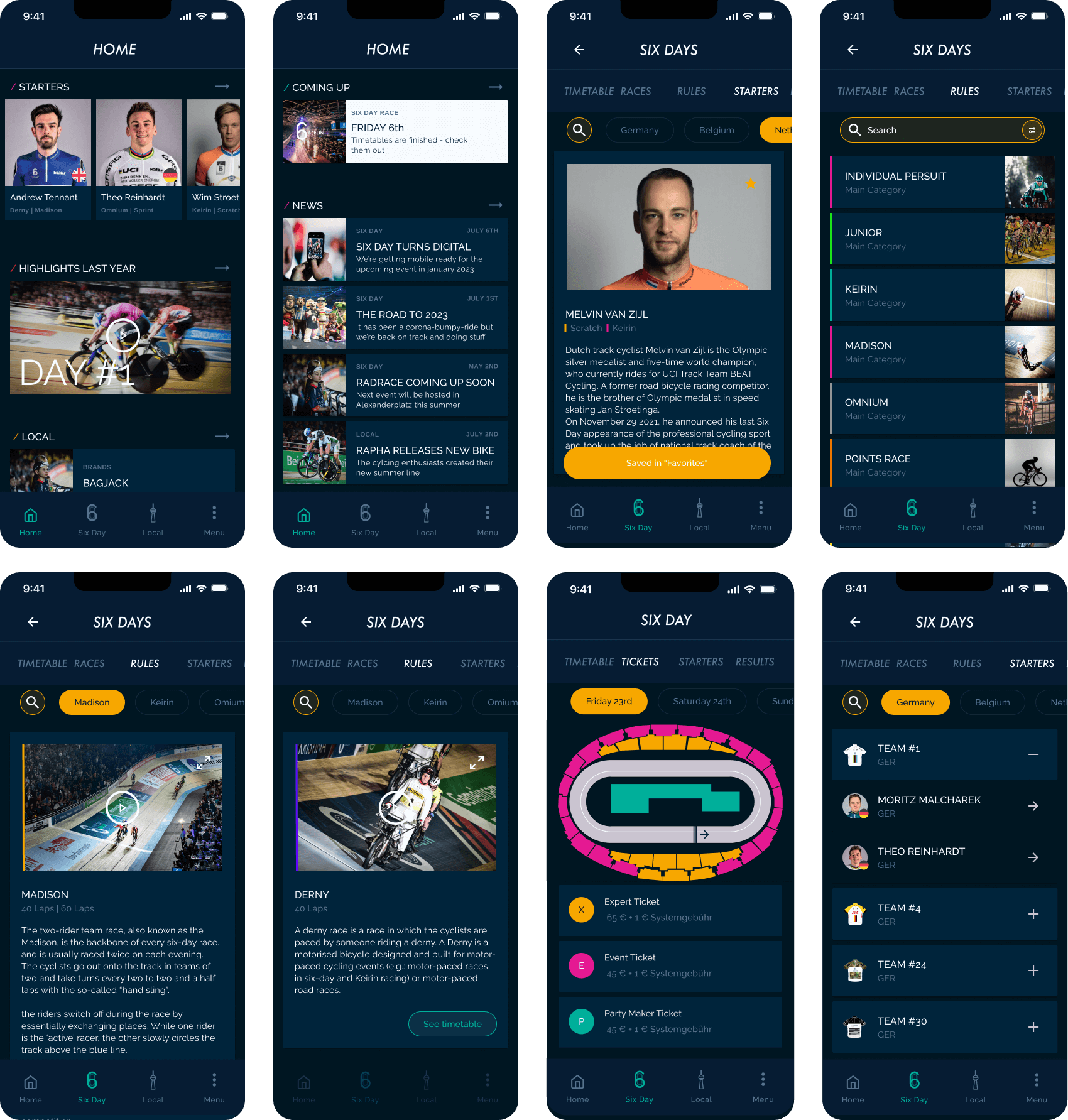
Final design hi-fidelity
After multiple tests and iterations, we came to a final design: a clear and organized layout of the interface, letting the user easily interact with the app. High contrasting elements, while matching the general feel and branding of Six Day.
The final design:
Lets users relate to the established Six Day event.
Shows the quality of the product.
Reflects a style that is suitable for different target audiences.
Aims towards the new direction Six Day wants to head to as a company.
Next steps
With the minimum viable product (MVP) tested in high-fidelity, now it’s time to test and define the right content for the users.
Since the success of the local-feature depends on the relevance of the local content, this will require special attention in the next phase.
If Six Day will have global reach, the development of a universal design system for the global Six Day Series (UK; Europe, Asia, Australia) will be provided.
Thanks for scrolling this far. If you have any questions regarding this case-study, feel free to reach out. Want to work together or hang out for any reason? Shoot me a message.
")